Karaz Health
- Client
- Karaz Health
- Industry
- Healthcare · Saudi Arabia · Diabetes management
- Scope
- Web app · Mobile · Clinical workflows
- Year
- 2023–2024
- Lumixel role
- Architecture + design system + execution
The problem — Three years live across Saudi hospitals. Piecemeal growth. No architecture. No design system. Two prior redesigns had failed. Mobile expansion forced the rebuild, desktop patterns wouldn't scale to phones, daily operations couldn't break, and the investor deadline was fixed.
The outcome — The mobile app shipped on the investor timeline. The rebuild went live without disrupting daily clinical operations. Care team onboarding dropped from six weeks to four days. Three clicks from login to full patient profile. Four clinical surfaces, Doctor, Nurse, Educator, and Patient, from one component set.
Context
Dr. Al-Sofiani returned to King Saud University after Johns Hopkins. He watched patients leave with prescriptions and return with uncontrolled glucose. The barrier wasn't medicine, it was systemic fragmentation across the care pathway. He built Karaz to close that gap: SFDA-licensed, live CGM data, AI-assisted insulin guidance, incentive-based habit tracking, and clinically validated workflows in one ecosystem.
Three years later, Karaz was running across Saudi hospitals. Features had been added piecemeal, a new role here, a new module there, with no central architecture decisions. Two prior attempts to fix it had failed: a contract designer who delivered a visual refresh that sat on top of the existing architecture without changing it, and an in-house hire who left after four months citing scope.
Mobile expansion was the forcing function. Desktop patterns wouldn't survive on a phone, forms with twelve fields, dashboards four levels deep, modals that opened modals. The product team realised mobile wasn't a new feature. It was the rebuild that should have happened a year earlier.
Two constraints were non-negotiable. The platform was live with daily clinical use: nothing could ship that broke existing workflows during transition. The mobile timeline had already been committed to investors.
The approach — Decisions first. Execution scoped from those decisions.
Phase 01
Architecture
Six weeks. We did not draw screens.
- 01
Role-based information maps across four surfaces.
Doctor, Nurse, Educator, Patient. The same clinical data needed to be accessible to each role, but the right surface depth was different for each. We mapped what each role actually needed at each touchpoint, and where each surface should stop showing more.
- 02
User flows for the full platform lifecycle.
Clinical workflows, patient management, scheduling, reporting. Every transition between roles, every handoff between surfaces, documented before any pixel was drawn.
- 03
Low-fidelity wireframes for every state.
Empty, mid-flow, full, edge, error. Reviewed end to end before colour, type, or component decisions entered the conversation.
- 04
One review session. One pushback.
Form density felt too administrative. We adjusted. They signed off. Phase 2 started Monday. Nothing was revisited.
Phase 02
Execution
Four parallel tracks. Each one designed against a specific moment in the clinician's day.
Selected work — Visual proof, abstracted under NDA.
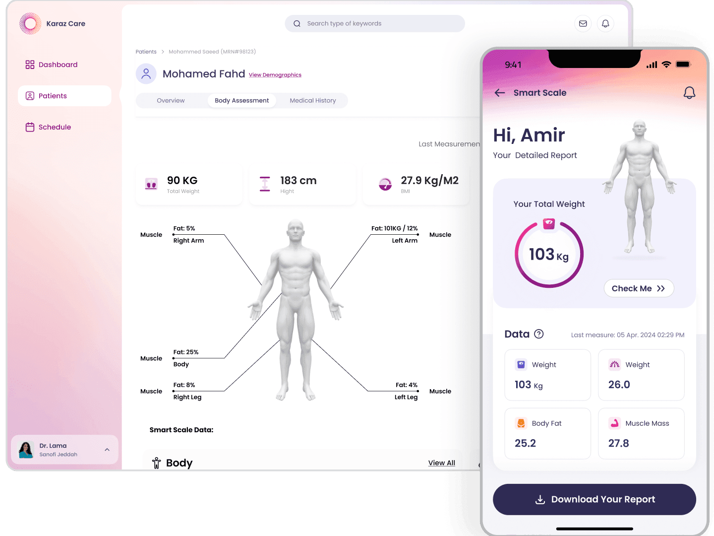
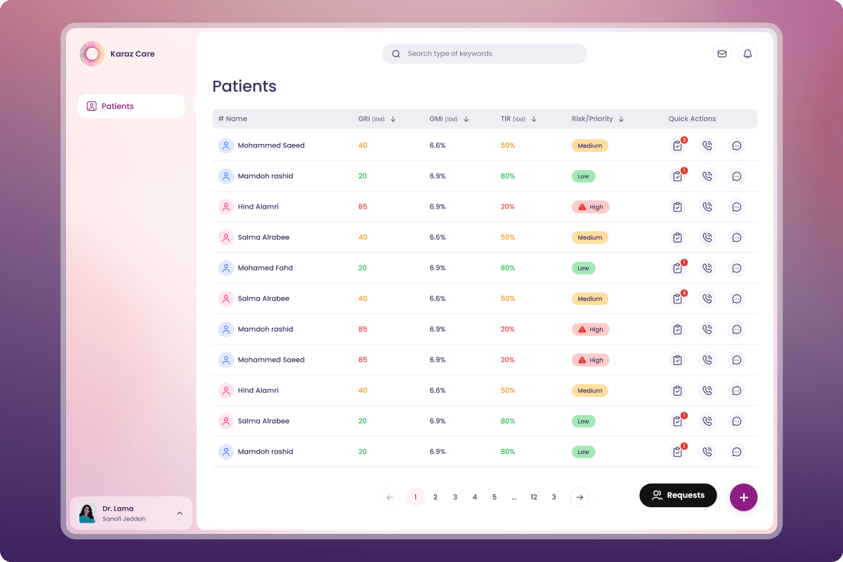
Patient management that respects clinical time.
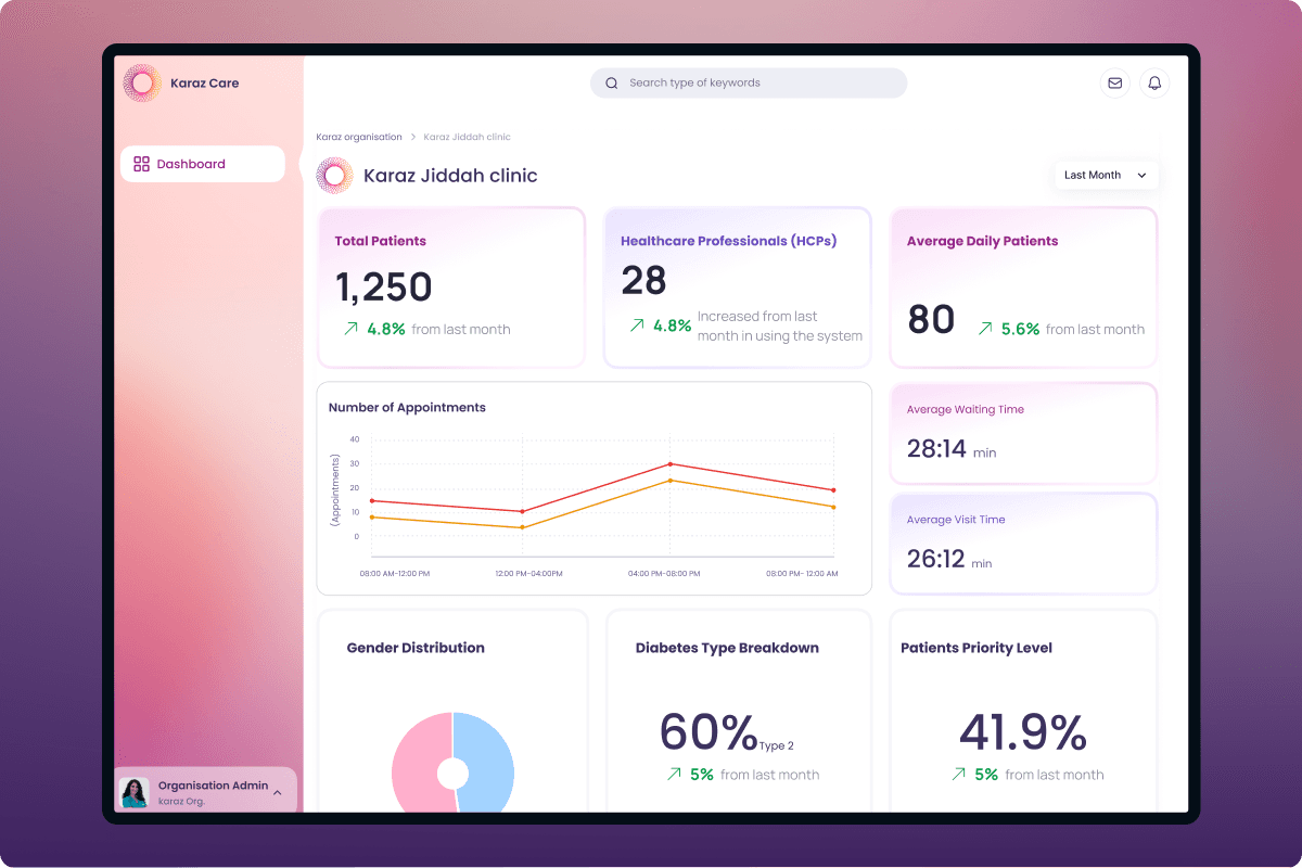
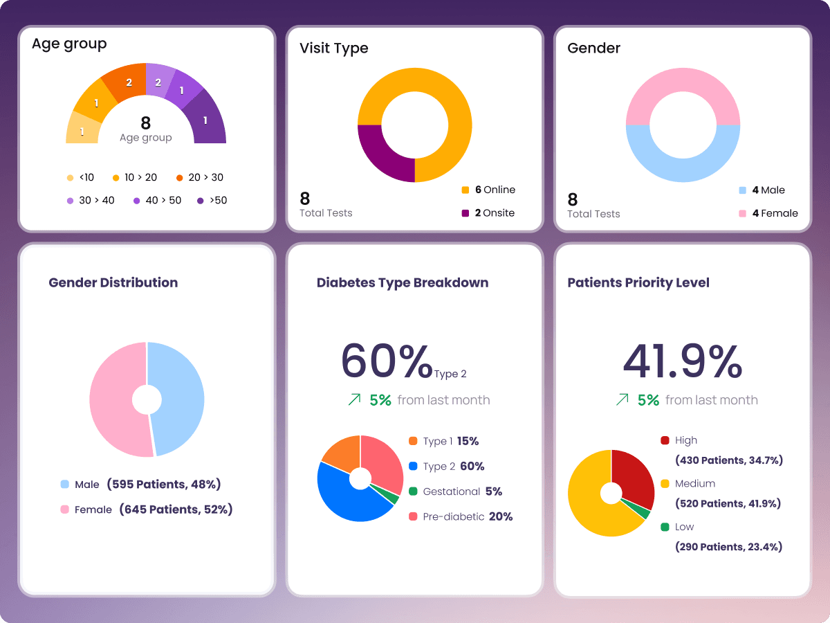
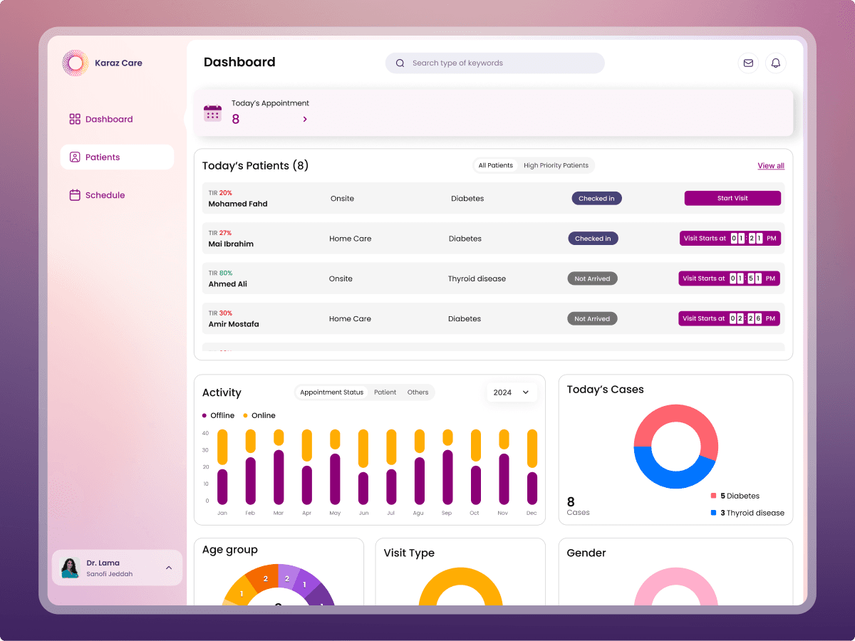
A dashboard with clinical pulse.
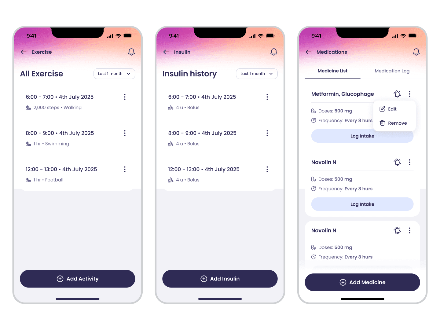
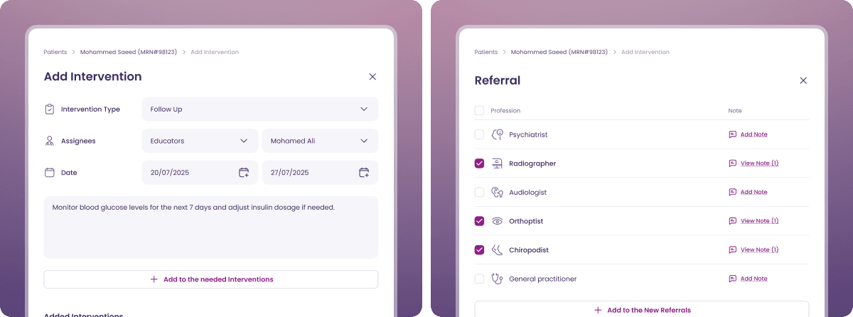
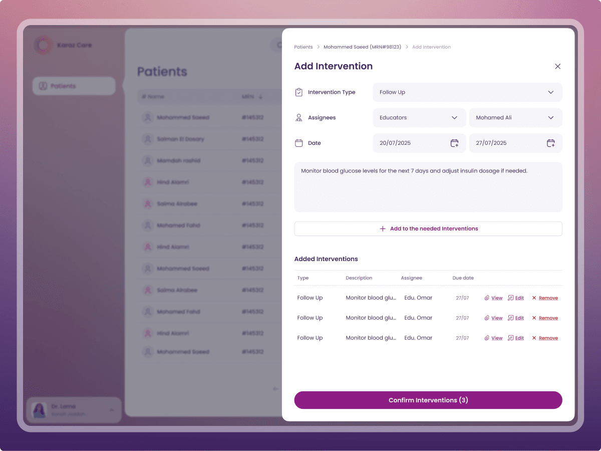
Interventions that close the loop.
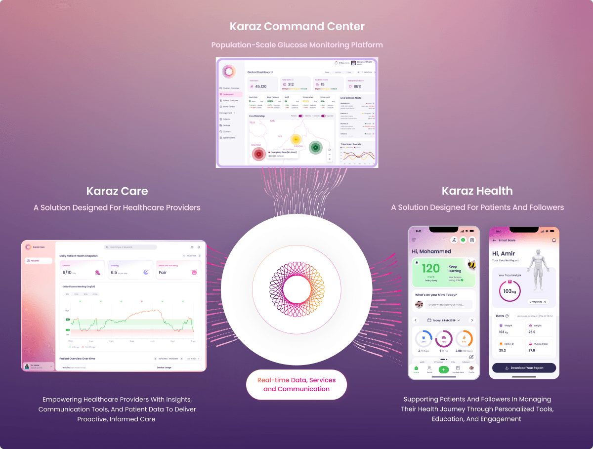
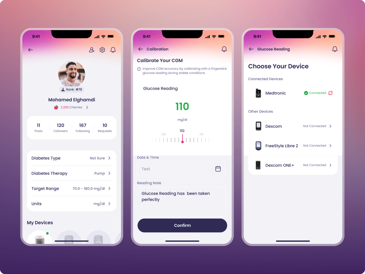
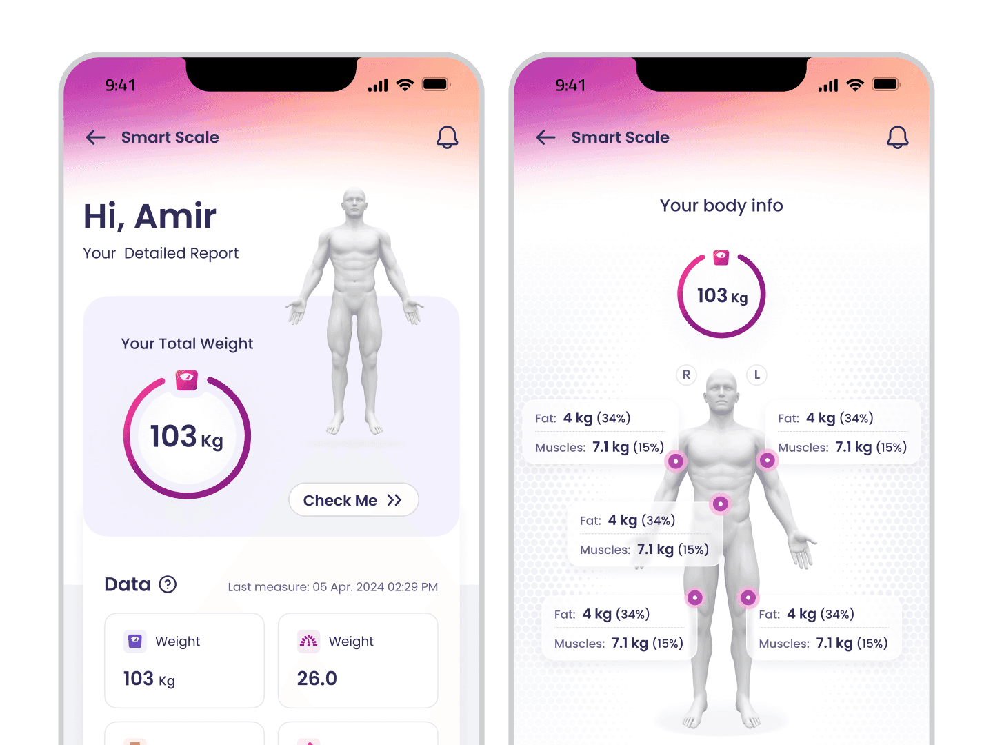
One system, any role, any workflow.
Key decisions — The trade-offs that shaped the work.
We considered
Building mobile as the responsive view of the web app, faster to ship, easier to maintain.
We chose
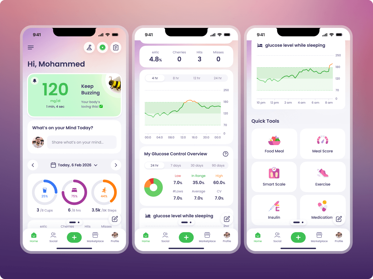
Designing mobile as a separate product that shares the system but not the layout. Different navigation, different information density, different primary actions.
Because
Clinicians use phones in fundamentally different contexts than they use web, between rooms, on rounds, with one hand. A responsive collapse of a 1400px dashboard wouldn't survive those contexts. The cost of designing a separate product was real. The cost of mobile users abandoning the platform after launch would have been larger.
We considered
Building mobile as the responsive view of the web app, faster to ship, easier to maintain.
We chose
Designing mobile as a separate product that shares the system but not the layout. Different navigation, different information density, different primary actions.
Because
Clinicians use phones in fundamentally different contexts than they use web, between rooms, on rounds, with one hand. A responsive collapse of a 1400px dashboard wouldn't survive those contexts. The cost of designing a separate product was real. The cost of mobile users abandoning the platform after launch would have been larger.
We considered
One dashboard for all roles, with labels and toolbar state handling the difference between Doctor, Nurse, Educator, and Patient.
We chose
A role-aware dashboard with distinct visual zones for each role, different overviews, different queues, different primary actions.
Because
A Doctor's overview, a Nurse's queue, an Educator's intervention list, and a Patient's daily check-in are not the same screen with different labels. Forcing them into one treatment would have meant either over-serving Patients with clinical density or under-serving Doctors with patient-app simplicity. Distinct zones let each role get its native rhythm.
We considered
One dashboard for all roles, with labels and toolbar state handling the difference between Doctor, Nurse, Educator, and Patient.
We chose
A role-aware dashboard with distinct visual zones for each role, different overviews, different queues, different primary actions.
Because
A Doctor's overview, a Nurse's queue, an Educator's intervention list, and a Patient's daily check-in are not the same screen with different labels. Forcing them into one treatment would have meant either over-serving Patients with clinical density or under-serving Doctors with patient-app simplicity. Distinct zones let each role get its native rhythm.
We considered
Custom per-role builds, each clinical surface as its own product, with its own components and its own release cadence.
We chose
A role-based design system: universal foundations, role-specific composition, role switching as a permission toggle rather than a code change.
Because
Custom per-role builds would have multiplied the maintenance surface and capped Karaz at the number of designers it could hire. Tokens and shared components turned a new clinical workflow into a two-week ship instead of a quarter-long one, and pushed care-team onboarding from six weeks to four days.
We considered
Custom per-role builds, each clinical surface as its own product, with its own components and its own release cadence.
We chose
A role-based design system: universal foundations, role-specific composition, role switching as a permission toggle rather than a code change.
Because
Custom per-role builds would have multiplied the maintenance surface and capped Karaz at the number of designers it could hire. Tokens and shared components turned a new clinical workflow into a two-week ship instead of a quarter-long one, and pushed care-team onboarding from six weeks to four days.
Outcome — What shipped.
4 days
Care-team onboarding, down from six weeks
3 clicks
From login to full patient profile
4
Clinical surfaces, Doctor · Nurse · Educator · Patient, one system
The mobile app shipped on the timeline Karaz had committed to investors. The rebuild went live without disrupting daily clinical workflow: no parallel-system period, no re-training cycle.
Care team onboarding dropped from six weeks to four days. Three clicks from login to full patient profile. Clinicians coordinate three times more interventions in parallel care-coordination phases than before the rebuild. Five fragmented touchpoints became one platform. The gap between glucose reading and clinical decision is closed.

Next case study — Benchmark
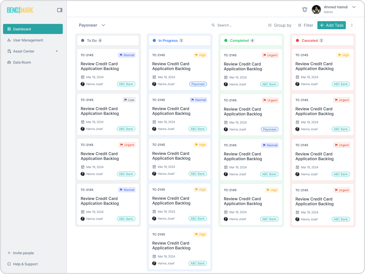
Multi-role fintech SaaS, re-architected from the inside out.