Benchmark

Client
Benchmark
Industry
Fintech · Task Management SaaS
Scope
Web app
Year
2024
Lumixel role
Architecture + Execution

The problemThree developers and a project manager inside a fintech company watched the same breakdown repeat across every bank partnership. Documents scattered across drives, status updates buried in Slack threads, internal legal reviews happening in channels where bank partners could see them. By month three, nobody knew which file was current.

The outcomeThe compliance team retired their parallel tracking sheet within the first month. Partnership reviews that previously required three tools now happen in one place. Internal teams have private space. Partners have transparent views. The audit trail is already there when a regulator asks for it.

Context

Three developers and a project manager. That was the team. They worked inside a fintech company, managing bank partnerships, and watched the same breakdown repeat. Documents scattered across drives. Status updates buried in Slack threads. Internal legal reviews happening in channels where bank partners could see them. By month three of any partnership, nobody knew which file was current.

They mapped a product to fix it. Called it Benchmark. They needed design to execute it. Lumixel built the architecture, flows, and wires. They signed off. Execution started the following week.

The structural problem: most tools treat every task the same. A marketing deadline and a regulatory review share the same card, same thread, same weight. Banks and fintech companies operate behind strict boundaries. Some conversations stay internal, others must be visible to both sides. When these worlds collide in a generic tool, teams over-share and create liability, or under-share and create delays. Benchmark had to close that gap.

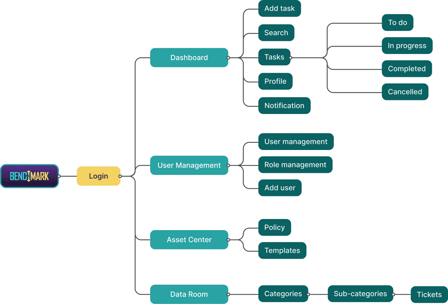
Information architecture: the task lifecycle and the internal/external boundary at every transition.
The approachDecisions first. Execution scoped from those decisions.


Phase 01

Architecture


Four weeks. We did not draw screens.

  1. 01

    Information architecture for the task lifecycle.

    We mapped every state a task could move through (from request, through internal review, through partner-visible review, to close) and where the internal/external boundary lived at each transition. The IA wasn't just navigation; it was a permissions model.

  2. 02

    User flows for three personas.

    Compliance officer, relationship manager, bank partner. The flows made the internal/external boundary visible at every decision point, so nothing ambiguous could leak across.

  3. 03

    Low-fidelity wireframes for the whole lifecycle.

    Wires covered the task surface, the kanban board, the comment thread, the user management table, and the document view. Enough to reason about structure without committing to visuals.

  4. 04

    Workshop and go/no-go gate.

    The Benchmark team reviewed the architecture in a two-hour workshop. Two questions surfaced: whether the internal-external boundary was too visible, and whether the kanban view would scale past ten partnerships. We adjusted the boundary treatment and stress-tested the column layout with fifteen mock partnerships. They signed off.

Phase 2 (execution) started the following week. Nothing from architecture was revisited. It was locked.


Phase 02

Execution


The architecture turned into screens, states, and a design system the engineering team could build against.

Selected workVisual proof from across the surface.

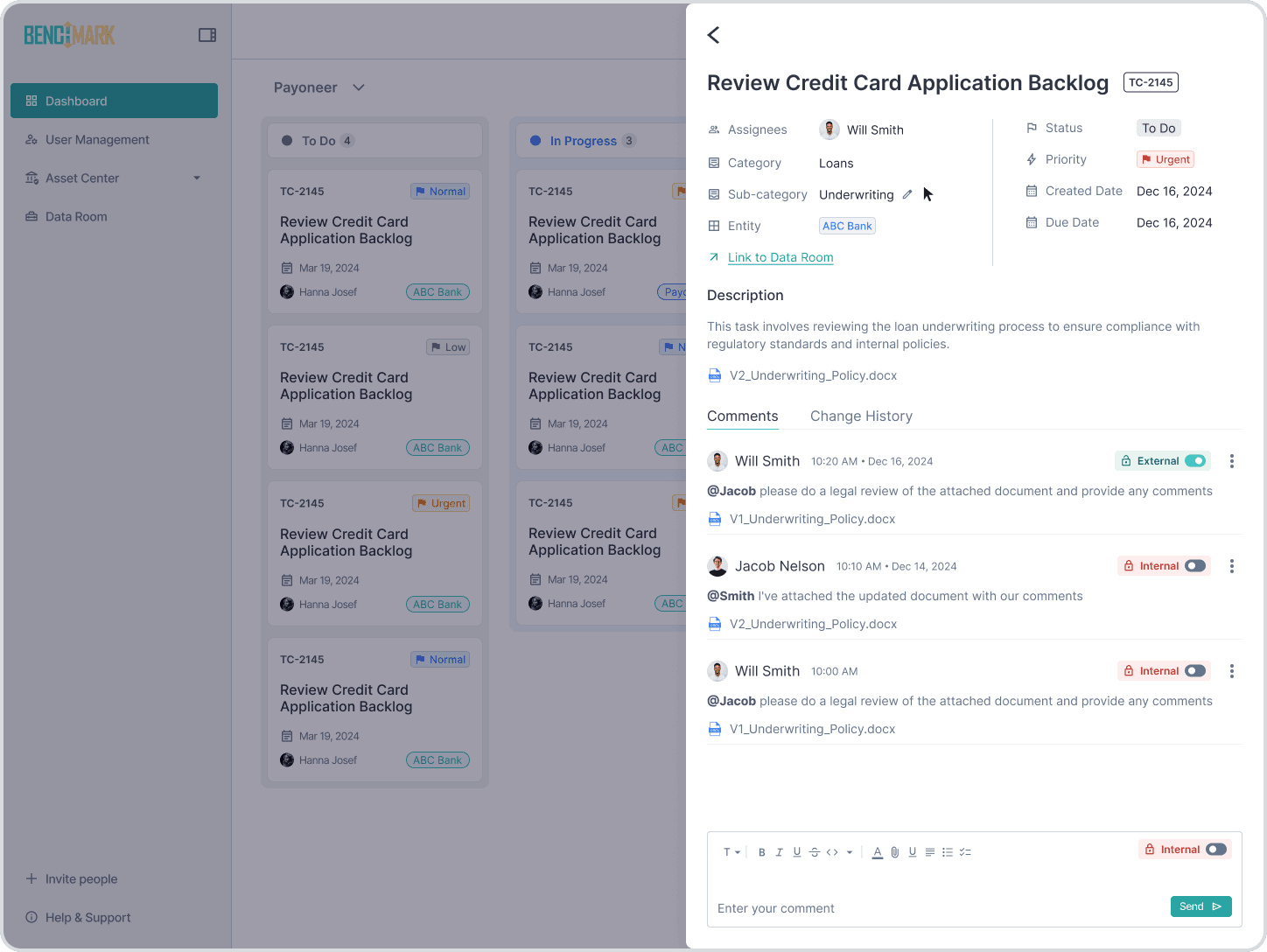
Two-context comments.

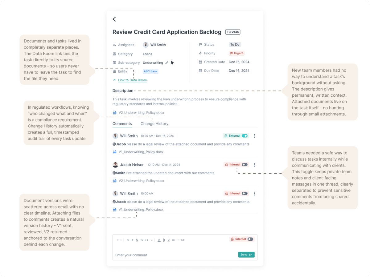
An inline privacy toggle sits next to every comment input. Internal stays with the team. External goes to the partner. Mentions, attachments, and inline previews carry the same toggle context. The boundary is impossible to miss.
Task detail. Comments thread on one side, annotated collaboration patterns on the other. Five decisions made visible.

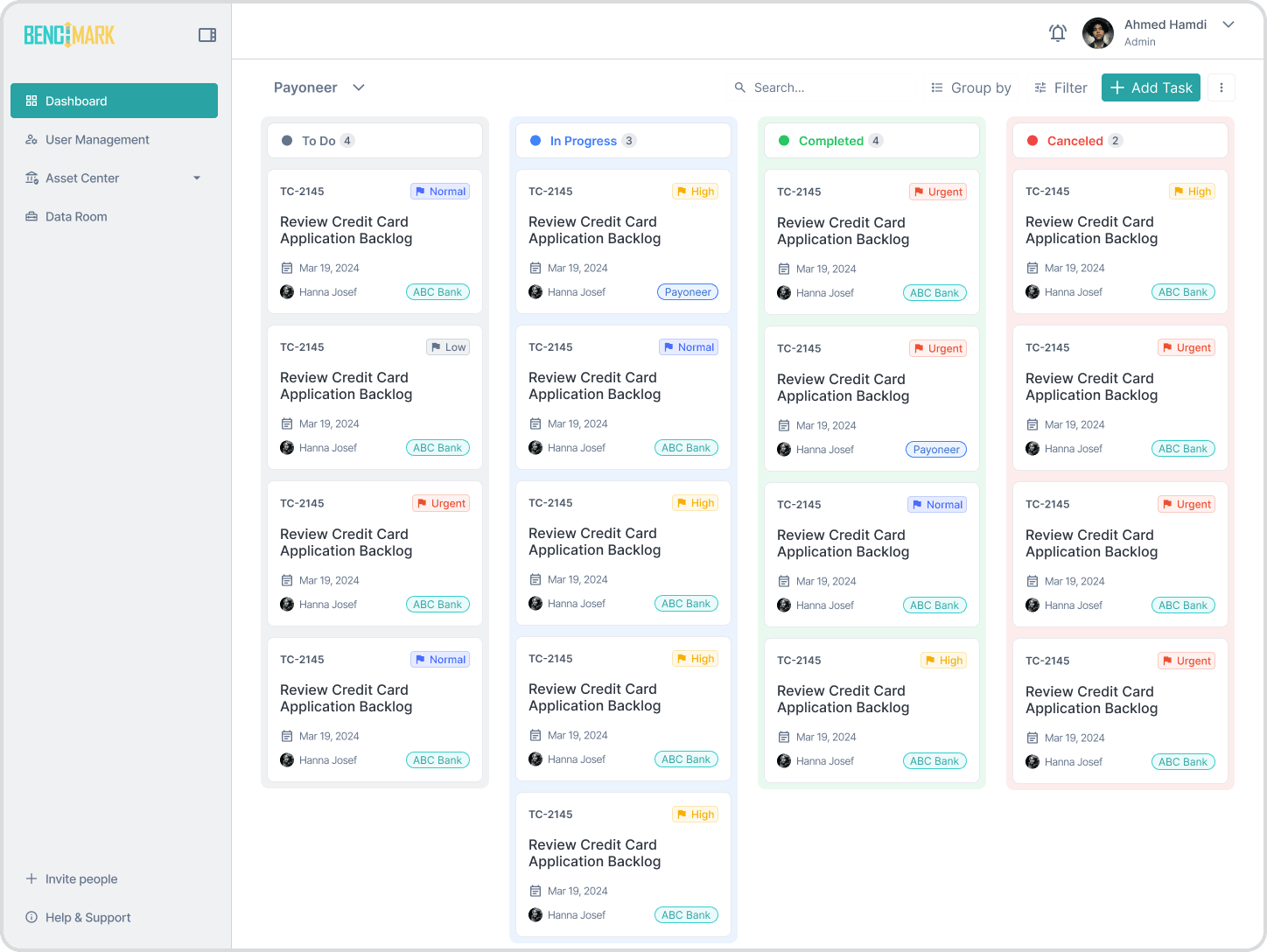
Portfolio kanban.

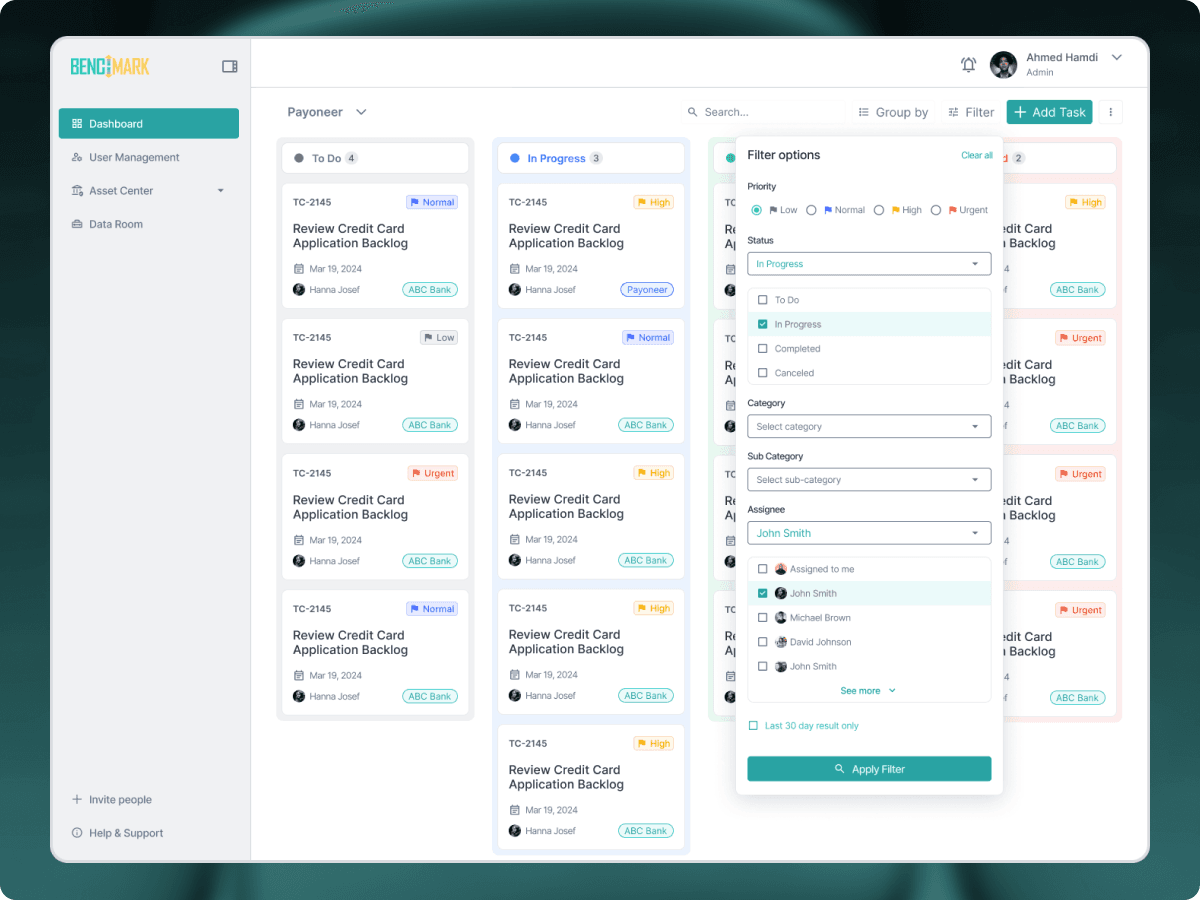
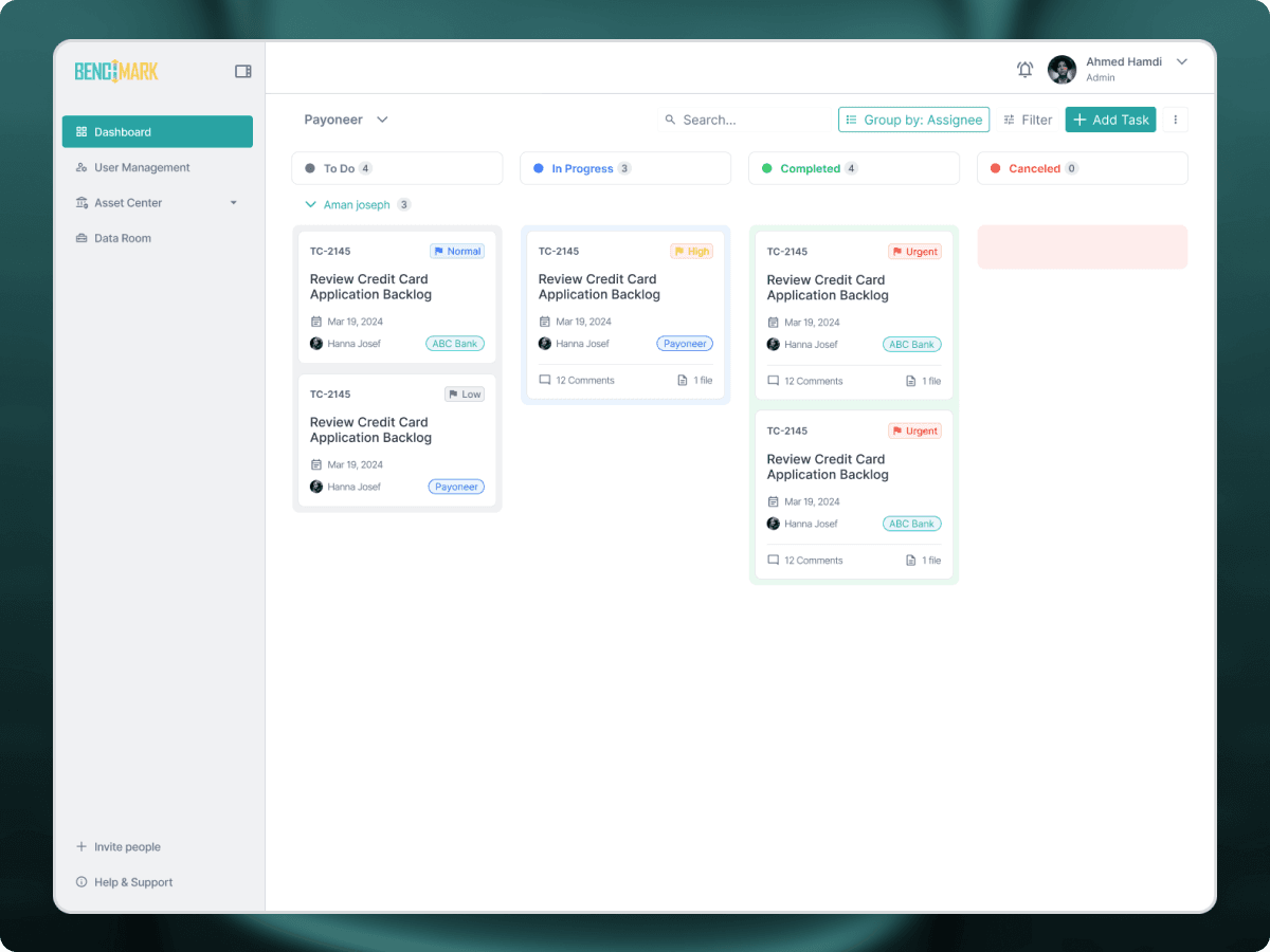
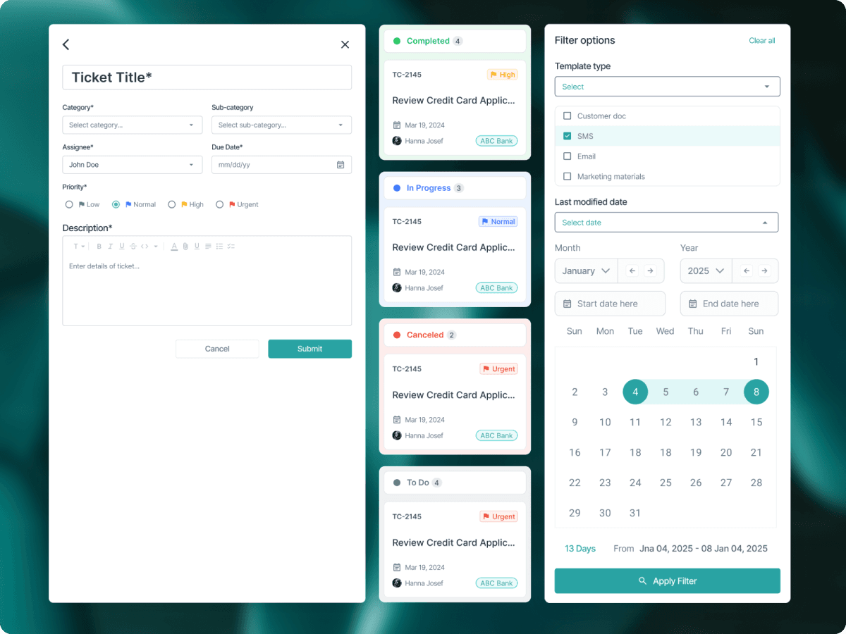
Four columns: To Do, In Progress, Completed, Canceled. Each card carries ID, priority, assignee, due date, and entity. Built for teams managing portfolios of partnerships simultaneously, not single projects.
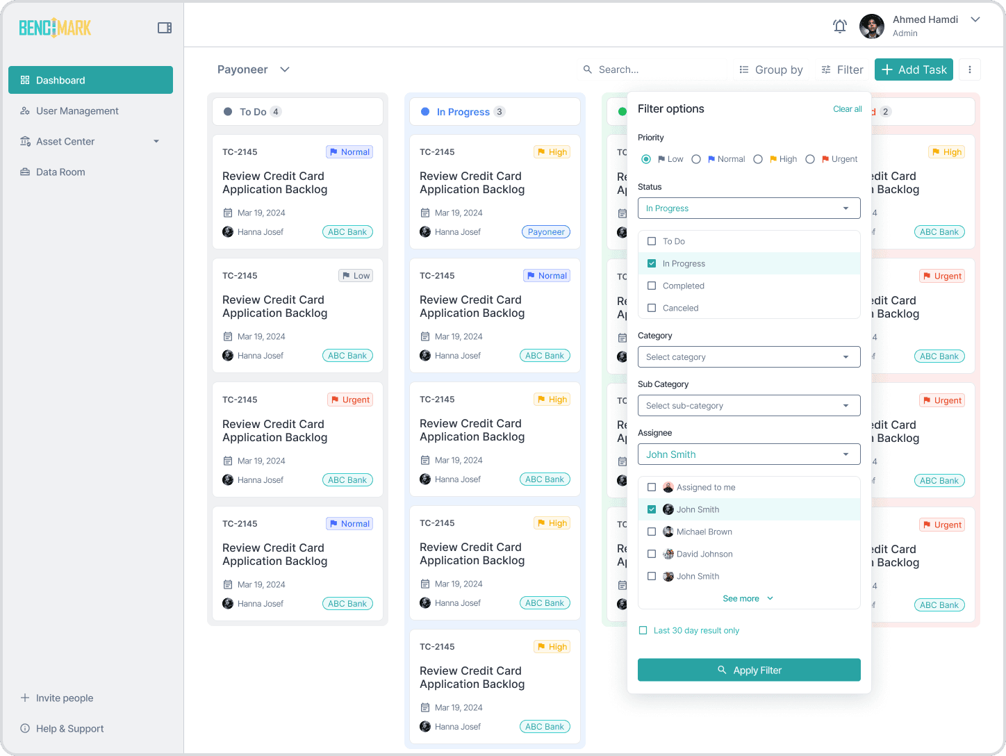
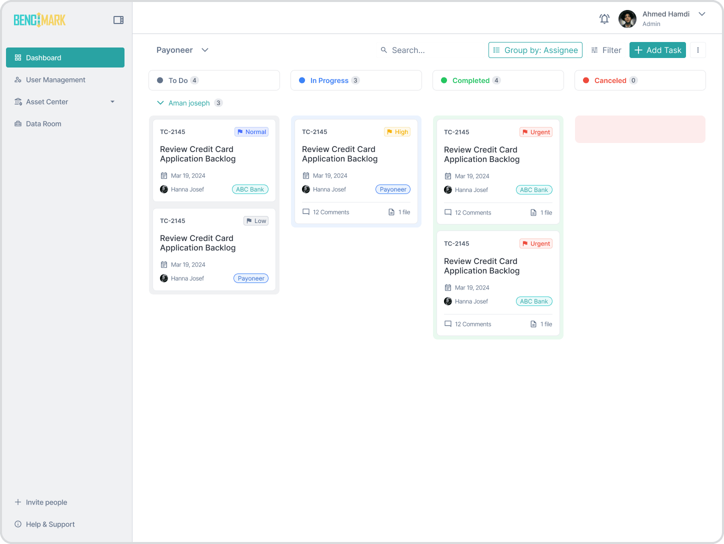
Portfolio kanban: filter options and assignee groupings. Built for portfolios of partnerships, not single projects.

Flat task structure.

No nested subtasks or dependency mapping. Documents attach directly, versions track in history, and a Data Room link sits one click away. The interface carries the regulatory weight that a generic checkbox ignores.
Task lifecycle across four states: request, review, close, audit trail. Read it as a sortable table or as a priority board.

Inline user management.

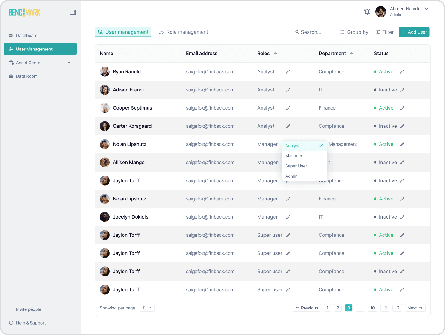
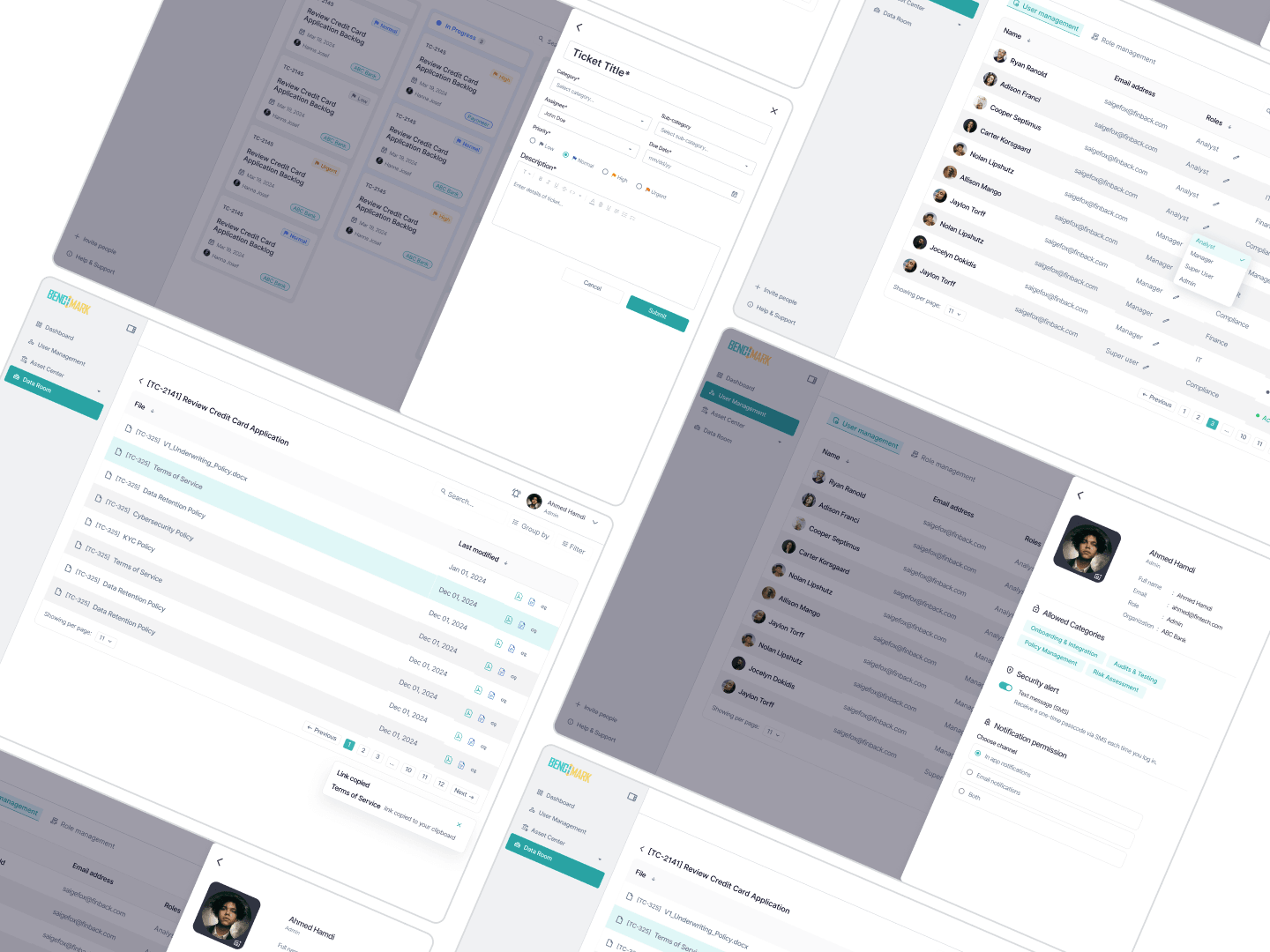
Administrators edit roles, departments, and status directly in the table view. No modal interruptions for bulk changes. Scan, edit, move.
User management: inline editing, no modal interruption.
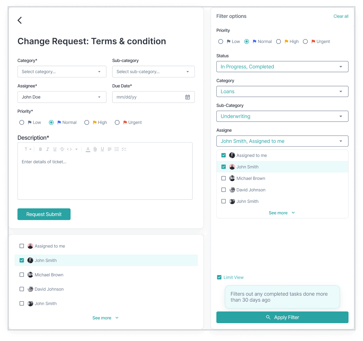
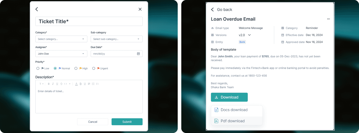
Forms that carry the regulatory weight: create-ticket and change-request flows.
Document versioning and the Data Room connection. The audit trail is built in.
One system, two surfaces: mobile task screens and the design-system collage that holds the whole platform together.

Key decisionsThe trade-offs that shaped the work.

We considered

Channel-based permissions (separate rooms per audience) or role-based filters (visibility derived from who's reading).

We chose

An inline toggle on the comment input itself: internal vs. external, switched per-message, visible to whoever is writing.

Because

Channel-based permissions created too many silos and broke continuity inside a single task. Role-based filters demanded constant admin as team composition changed. The toggle keeps both audiences inside one thread but makes the boundary impossible to miss. It's the guardrail against the mistake that derails a partnership.

We considered

A list view, the default for most task tools.

We chose

A kanban board with four status columns as the primary view.

Because

Teams weren't managing one project, they were managing portfolios of partnerships simultaneously: ABC Bank, Payoneer, three others, all at different stages. A list view forces filtering before you can read state. The board reads state at a glance. We stress-tested the column layout with fifteen mock partnerships before signing off the architecture.

We considered

A modal-based edit flow for user management, the most common pattern.

We chose

Inline editing inside the user table: roles, departments, and status all assignable in place.

Because

The modal broke context for bulk changes. Administrators in large organizations don't edit one user at a time; they reconcile a list. Inline editing kept them in the table view, where they could scan, edit, and move without losing their place.

OutcomeWhat shipped.

3

Personas served on a single surface

4

Weeks of architecture before execution

1

Month to retire the parallel tracking sheet

The compliance team retired their parallel tracking sheet within the first month. Nobody asks “which file is the latest?” anymore. The trail is already there when a regulator asks for it.
Benchmark shipped as a web application with a design system built for expansion. The fragmented stack of spreadsheets, emails, and generic tools became one environment. Internal teams have private space. Partners have transparent views. Documents have a home.

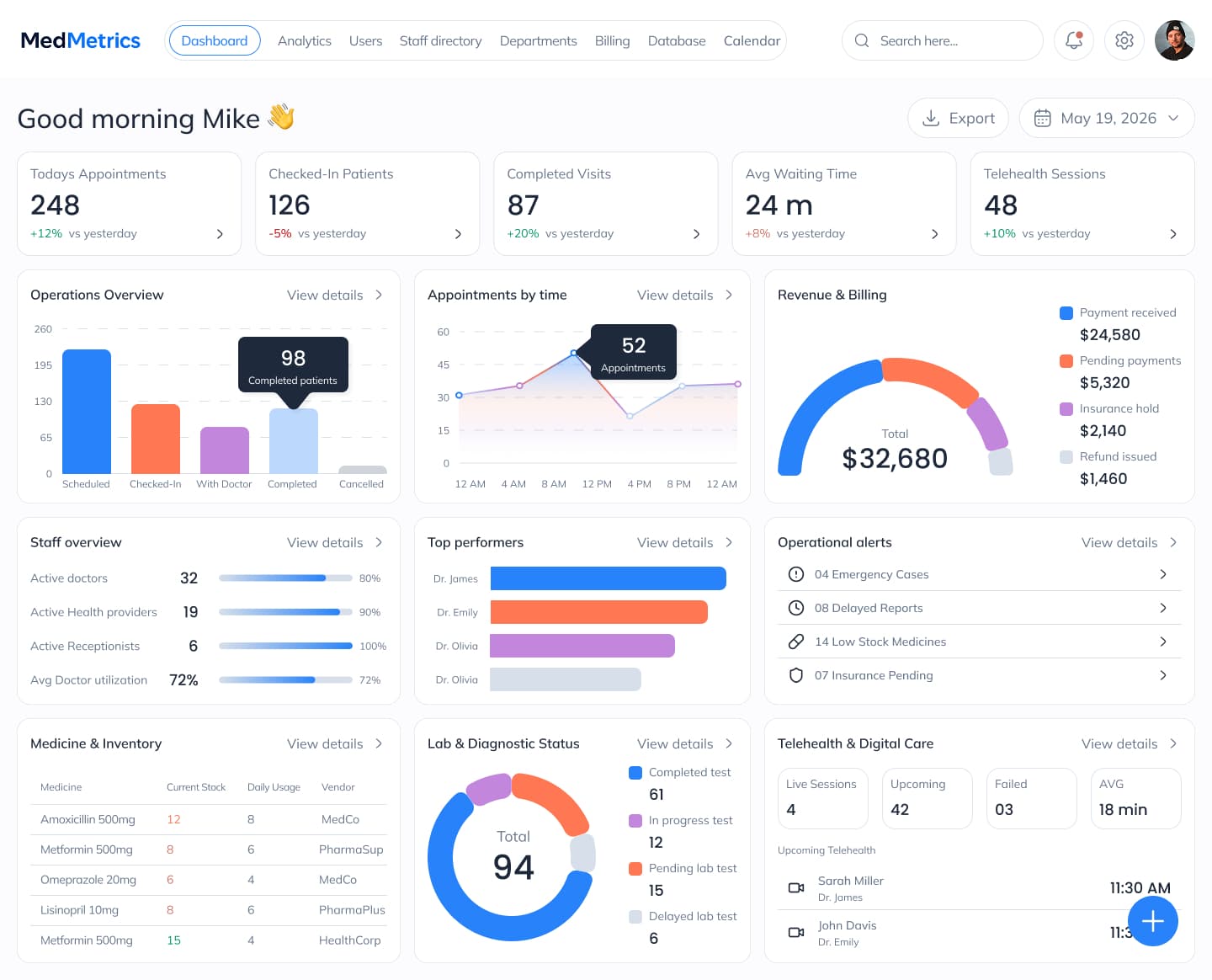
MedMetrics admin operational dashboard with queue, revenue, staff, inventory, and operational alerts

Next case study — MedMetrics

One patient record. Five roles. Zero manual handoffs.

Or, book a discovery call.