Ideaclouds
- Client
- Ideaclouds
- Industry
- Enterprise SaaS · Workshop platform
- Scope
- Web app · UI/UX · Product strategy · Design system
- Year
- 2024–2025
- Lumixel role
- Product strategy + UI/UX + Design system
The problem — Workshops stretched across weeks. One voice dominated the room. Good ideas died to hierarchy bias. By the time a decision emerged, momentum was gone.
The outcome — Enterprise onboarding dropped from six weeks to four days. Setup takes ninety seconds. Workshops finish in one sitting. Fifteen workshop methods run from one design system. Nokia, Bosch, and MAHLE run it without custom code.
Context
A team of twelve inside Nokia, Bosch, MAHLE, TÜV Nord, and Schneider Electric had watched the same pattern play out for years. Workshops stretched across weeks. One voice dominated the room. Good ideas died to hierarchy bias. By the time a decision emerged, momentum was gone.
They built Ideaclouds, Input, Evaluate, Decide, to close that gap: parallel contribution, anonymous scoring, structured consensus. The product worked. The design did not yet match its ambition. Enterprise buyers expected polish and white-labeling out of the box, and the platform could not deliver either fast enough.
Two constraints worth naming. The platform had to support fifteen distinct workshop methods, each with its own card types, scoring logic, and layout, from one component system. Enterprise clients needed white-labeling tight enough to feel like an internal tool, fast enough not to bottleneck sales.
The approach — Decisions first. Execution scoped from those decisions.
Phase 01
Architecture
Five weeks. We did not draw screens.
- 01
Information maps across three roles.
Facilitators, participants, and administrators each touch the workshop at different depths. We mapped what each role needed at each phase, and where each surface should stop showing more.
- 02
User flows for the full workshop lifecycle.
From workshop creation through Input, Evaluate, Decide, and out to results and export. Every transition documented before any pixel was drawn.
- 03
Low-fidelity wireframes for every state.
Empty, mid-flow, full, edge, error. Reviewed end to end before colour, type, or component decisions entered the conversation.
- 04
One review session. One pushback.
Phase controls felt too survey-like. We adjusted. They signed off. Phase 2 started Monday. Nothing was revisited.
Phase 02
Execution
Four parallel tracks. Each one designed against a specific moment in the facilitator's day.
Selected work — Visual proof across the platform.
Workshop creation that respects your time.
A canvas with a pulse.
Results that speak for themselves.
One system, any method, any brand.
Key decisions — The trade-offs that shaped the work.
We considered
Surfacing the full library of fifteen methods up front, every option visible, no hidden depth.
We chose
A hybrid flow: six most-used methods first with visual previews; a Show-All toggle for power users. Settings grouped by phase, with pre-filled defaults reducing configuration to three clicks.
Because
Facilitators are senior managers scheduling between meetings. They needed a workshop live in under two minutes, not fifteen. The full library still mattered, but only after the common case was effortless. Defaults carry the cognitive load that menus otherwise would.
We considered
Surfacing the full library of fifteen methods up front, every option visible, no hidden depth.
We chose
A hybrid flow: six most-used methods first with visual previews; a Show-All toggle for power users. Settings grouped by phase, with pre-filled defaults reducing configuration to three clicks.
Because
Facilitators are senior managers scheduling between meetings. They needed a workshop live in under two minutes, not fifteen. The full library still mattered, but only after the common case was effortless. Defaults carry the cognitive load that menus otherwise would.
We considered
One canvas, one visual treatment, with mode switches handled by labels and toolbar state.
We chose
A phase-aware canvas with distinct visual states for Input, Evaluate, and Decide, different grids, different controls, different rhythm.
Because
Participants joining mid-session shouldn't have to read a header to know what they're meant to do. The shape of the screen had to answer that question on its own. Facilitators got rhythm control from a single toggle; participants got orientation for free.
We considered
One canvas, one visual treatment, with mode switches handled by labels and toolbar state.
We chose
A phase-aware canvas with distinct visual states for Input, Evaluate, and Decide, different grids, different controls, different rhythm.
Because
Participants joining mid-session shouldn't have to read a header to know what they're meant to do. The shape of the screen had to answer that question on its own. Facilitators got rhythm control from a single toggle; participants got orientation for free.
We considered
Building each enterprise rollout as a custom branded fork, flexible, but expensive to maintain across fifteen workshop methods.
We chose
A token-based design system: universal foundations, method-specific composition, white-labeling as a token swap rather than a code change.
Because
Onboarding economics decide whether an enterprise SaaS scales. Custom forks per client would have capped Ideaclouds at the number of designers it could hire. Tokens turn brand setup into a config step, and pushed enterprise onboarding from six weeks to four days.
We considered
Building each enterprise rollout as a custom branded fork, flexible, but expensive to maintain across fifteen workshop methods.
We chose
A token-based design system: universal foundations, method-specific composition, white-labeling as a token swap rather than a code change.
Because
Onboarding economics decide whether an enterprise SaaS scales. Custom forks per client would have capped Ideaclouds at the number of designers it could hire. Tokens turn brand setup into a config step, and pushed enterprise onboarding from six weeks to four days.
Outcome — What shipped.
90s
From login to live workshop session
4 days
Enterprise onboarding, down from six weeks
15
Workshop methods from one design system
Ideaclouds now looks like what it is: a serious enterprise tool that replaces weeks of meetings with a single, structured, decisive session. Workshops finish in one sitting. Participants contribute three times more ideas in parallel input phases than in comparable unstructured meetings. Results export directly into project-management tools.
Enterprise onboarding dropped from six weeks to four days. White-labeling is a token swap, not a code change.
Next case study — Karaz Health
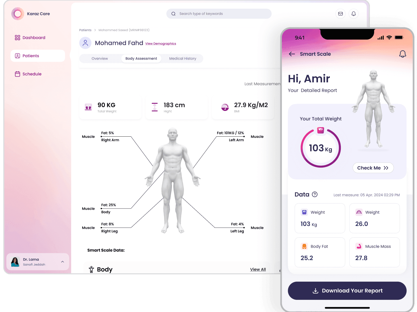
Healthcare SaaS, KSA, re-architected and shipped across web, mobile, and admin in five months.