
Haven
- Client
- Haven
- Industry
- Health & Wellness · Mobile
- Scope
- iOS app · Design system · User flows · Launch interface
- Year
- 2024
- Lumixel role
- Product strategy + design + system
The problem — Streak counters make users feel shame after missed days. Home screens with categories and search bars overwhelm stressed users before they can start. The industry optimises for engagement. Haven needed to optimise for relief.
The outcome — Interrupted sessions resumed at sixty percent, against industry averages below twenty. Time from open to first session dropped from forty seconds to under five. Users returning after gaps of seven or more days were twice as likely to complete a session. One recommendation on the home screen. A timeline that never resets.
Context
Haven was pre-launch. The team had a working prototype and early interviews. They needed a full product design system, user flows, and a launch-ready interface.
They came to us with a single principle, and they were not willing to negotiate it. Every screen should make the user feel they had done enough. Not behind. Not catching up. Not judged. Done.
The constraint was sharper than it sounded. Most wellbeing apps inherit shape from productivity tools, streaks, scores, weekly targets, completion rings. None of that could carry over. We had to rebuild the primitives, not restyle them.
The approach — Decisions first. Execution scoped from those decisions.
Phase 01
Architecture
Four weeks. Weekly reviews. We did not draw a high-fidelity screen.
- 01
Information architecture without an engagement spine.
Most wellbeing apps anchor IA on streaks, categories, and difficulty levels, patterns borrowed from productivity software. We mapped Haven around two surfaces instead: one context-aware recommendation at the top of every session, and a non-resetting timeline of everything the user had already done.
- 02
User flows for every state, including the missing days.
Onboarding, daily session, interruption, return after gaps, feedback after milestones. Each flow documented end to end, including the seven-day gap and the three-week return, the states most apps treat as failure.
- 03
Low-fidelity wireframes for every screen.
Empty, mid-session, paused, returned, complete. Reviewed weekly. We locked the no-failure-states principle in week two and the Journey Timeline plus Right Now card in week three.
- 04
Two tests for every screen.
Does this imply the user failed? Does this require a decision before relief? Any screen that answered yes to either went back into the architecture, not forward into UI.
Phase 02
Execution
Three weeks. UI kit, high-fidelity screens, component library, every screen stress-tested against the same two questions from architecture.
Selected work — Visual proof across the app.
A home screen with one card, not a library.
A Journey Timeline that never resets.
Save for Later as the only exit.
The Pulse tab, observations from a friend, not metrics.
Key decisions — The trade-offs that shaped the work.
We considered
A weekly completion ring, a session counter, or a calendar heat map, the three progress patterns most wellbeing apps inherited from fitness tracking.
We chose
A Journey Timeline that never resets, sage-green dots for sessions, rest days for gaps, welcome-back cards for returns after three or more days, inline milestones.
Because
Any visual that invites comparison against a perfect record recreates shame. The completion ring turned empty space into failure. The heat map turned sparse usage into inactivity. A non-resetting timeline lets a missed week read as rest, not relapse.
We considered
A weekly completion ring, a session counter, or a calendar heat map, the three progress patterns most wellbeing apps inherited from fitness tracking.
We chose
A Journey Timeline that never resets, sage-green dots for sessions, rest days for gaps, welcome-back cards for returns after three or more days, inline milestones.
Because
Any visual that invites comparison against a perfect record recreates shame. The completion ring turned empty space into failure. The heat map turned sparse usage into inactivity. A non-resetting timeline lets a missed week read as rest, not relapse.
We considered
A grid of category tiles, a personalised feed, or a daily featured session, three home-screen patterns that all asked the user to choose, scroll, or comply before they could start.
We chose
One Right Now card with an emotional descriptor, a pulsing breathing orb, and a single tap target. Everything else, categories, search, difficulty levels, behind an opt-in explore link further down.
Because
Stressed users opened the app and stalled at the choice itself. Cognitive load before relief is the wrong order. One card, one tap. Time-to-first-session dropped from forty seconds to under five.
We considered
A grid of category tiles, a personalised feed, or a daily featured session, three home-screen patterns that all asked the user to choose, scroll, or comply before they could start.
We chose
One Right Now card with an emotional descriptor, a pulsing breathing orb, and a single tap target. Everything else, categories, search, difficulty levels, behind an opt-in explore link further down.
Because
Stressed users opened the app and stalled at the choice itself. Cognitive load before relief is the wrong order. One card, one tap. Time-to-first-session dropped from forty seconds to under five.
We considered
A pause-and-resume flow with a quit option, auto-save on backgrounding, or a soft fade-out animation, three ways apps usually handle interrupted sessions.
We chose
Save for Later as the single exit path for every active session. No quit button. No X. No end-session language anywhere in the app.
Because
Standard quit language frames interruption as giving up. Auto-save was invisible and users did not trust it. A fade-out felt like an ending. Save for Later names the interruption as legitimate: the session pauses and waits. Resume rate hit sixty percent, against an industry baseline below twenty.
We considered
A pause-and-resume flow with a quit option, auto-save on backgrounding, or a soft fade-out animation, three ways apps usually handle interrupted sessions.
We chose
Save for Later as the single exit path for every active session. No quit button. No X. No end-session language anywhere in the app.
Because
Standard quit language frames interruption as giving up. Auto-save was invisible and users did not trust it. A fade-out felt like an ending. Save for Later names the interruption as legitimate: the session pauses and waits. Resume rate hit sixty percent, against an industry baseline below twenty.
We considered
A mood trend graph, a session frequency chart, or a total minutes counter, the three progress surfaces wellbeing apps borrow from quantified-self tooling.
We chose
A Pulse tab with pattern observations, no mood scores, no trendlines, no performance targets. Just behavioural insights based on actual app usage, written like notes from a friend.
Because
Post-session mood ratings turn wellbeing into a score to optimise. The frequency chart recreated the streak dynamic by another name. The minutes counter felt empty. Observations drawn from behaviour, not self-report, keep the user out of the role of judge.
We considered
A mood trend graph, a session frequency chart, or a total minutes counter, the three progress surfaces wellbeing apps borrow from quantified-self tooling.
We chose
A Pulse tab with pattern observations, no mood scores, no trendlines, no performance targets. Just behavioural insights based on actual app usage, written like notes from a friend.
Because
Post-session mood ratings turn wellbeing into a score to optimise. The frequency chart recreated the streak dynamic by another name. The minutes counter felt empty. Observations drawn from behaviour, not self-report, keep the user out of the role of judge.
We considered
A full survey after ten sessions, a star rating system, or an always-available feedback link, the three feedback patterns that either feel like homework or get ignored.
We chose
A contextual feedback card with emoji-scale response and optional text, no required fields. Triggered after natural session milestones and returns from gaps, not on a schedule.
Because
A survey feels like a test. Star ratings turn the app into a product review. An always-available link is invisible. A single emoji question after a real moment reads as conversation, not assessment. The team gets signal without adding burden.
We considered
A full survey after ten sessions, a star rating system, or an always-available feedback link, the three feedback patterns that either feel like homework or get ignored.
We chose
A contextual feedback card with emoji-scale response and optional text, no required fields. Triggered after natural session milestones and returns from gaps, not on a schedule.
Because
A survey feels like a test. Star ratings turn the app into a product review. An always-available link is invisible. A single emoji question after a real moment reads as conversation, not assessment. The team gets signal without adding burden.
Outcome — What shipped.
2x
Return-session completion after 7-day gaps vs baseline
5s
Time from open to first session, down from 40 seconds
60%
Interrupted sessions resumed, industry baseline under 20%
Haven shipped with a full iOS design system, fourteen documented user flows, and a component library. The team launched to beta users.
Users returning after gaps of seven days or more were twice as likely to complete a session on return compared to baseline meditation-app benchmarks. The Right Now card reduced time-to-first-session from forty seconds to under five. The Save for Later exit meant interrupted sessions resumed at sixty percent, against industry averages below twenty.
The design system supports a three-person team to ship updates weekly without visual drift.
“I missed two weeks. The app didn’t shame me. It said welcome back. That changed everything.”
- ·Product strategy
- ·Information architecture
- ·User experience design
- ·User interface design
- ·Design systems
- ·Usability testing
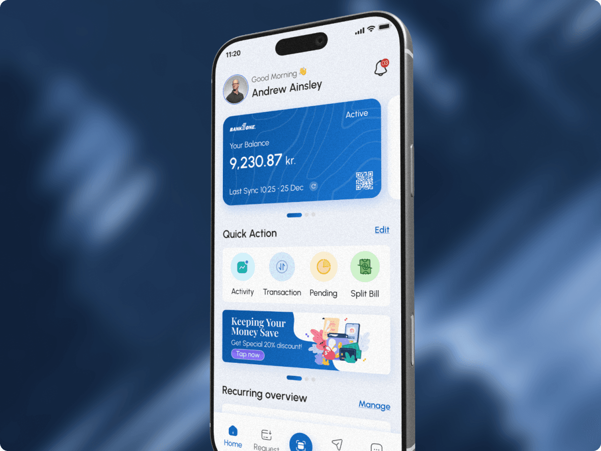
Next case study — FePay
A single mobile app for every Danish payment, onboarding, peer-to-peer, bill splits, and recurring subscriptions in one gateway.