FePay

Client
FePay
Industry
Fintech · Denmark · Payment gateway
Scope
Mobile app · Onboarding · Payments · Subscriptions
Year
2023–2024
Lumixel role
End-to-end product design + design system

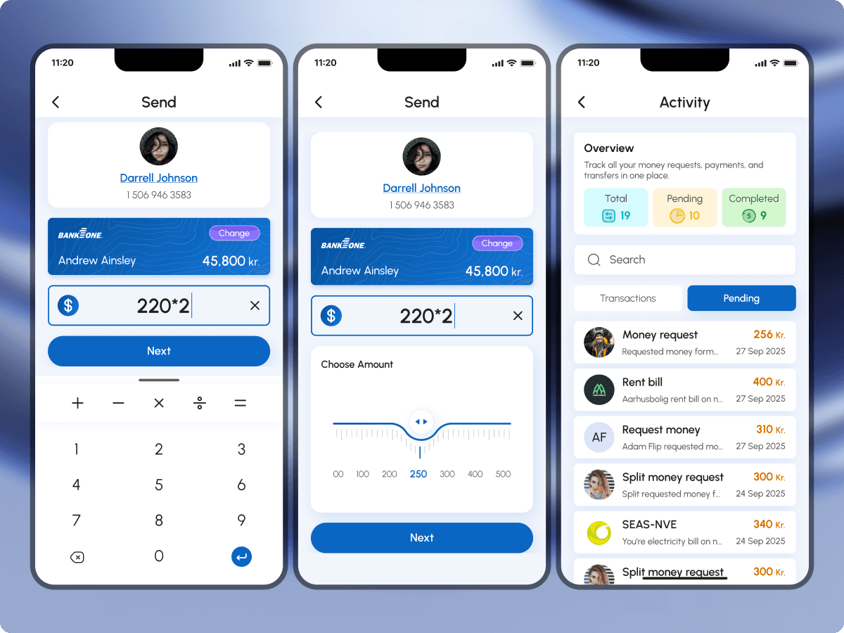
The problemFePay raised millions in 2023. Engineers were in place. There was no product. Bank connections were broken. Send confused users. Splitting a bill took six taps. Recurring payments lived in separate apps. A year of building. Nothing shipped.

The outcomeLive and processing payments. Onboarding takes ninety seconds. Drop-off through MitID held under eight percent. Split-bill payment rate hit ninety-four percent in beta. One gateway for every Danish payment type, from peer-to-peer to recurring subscriptions.

Context

FePay had funding, an engineering team, and a year of work, and nothing in market. The product brief had drifted into a stack of payment features that didn't add up to a single app. Bank connections kept breaking. The send flow had grown so many edge-cases that core users couldn't reliably get through it. A bill split took six taps. Recurring payments lived somewhere else entirely.

The Danish payment market made the gap painful. MobilePay had trained the country to expect contact-based sending in seconds. Utilities, rent, and subscriptions lived across separate portals. Any new app had to feel like a single, native replacement, not a fifth tab in someone's wallet.

FePay paused internal engineering. Lumixel built the entire app from scratch: onboarding to every transaction, one gateway, one interface. Two constraints shaped every decision. Danish law requires MitID, and most apps treat it as a wall: bounce to a browser, lose users. Every flow also had to feel native to Danish payment habits, contact-first, not QR-first, phone only, not email-verified.

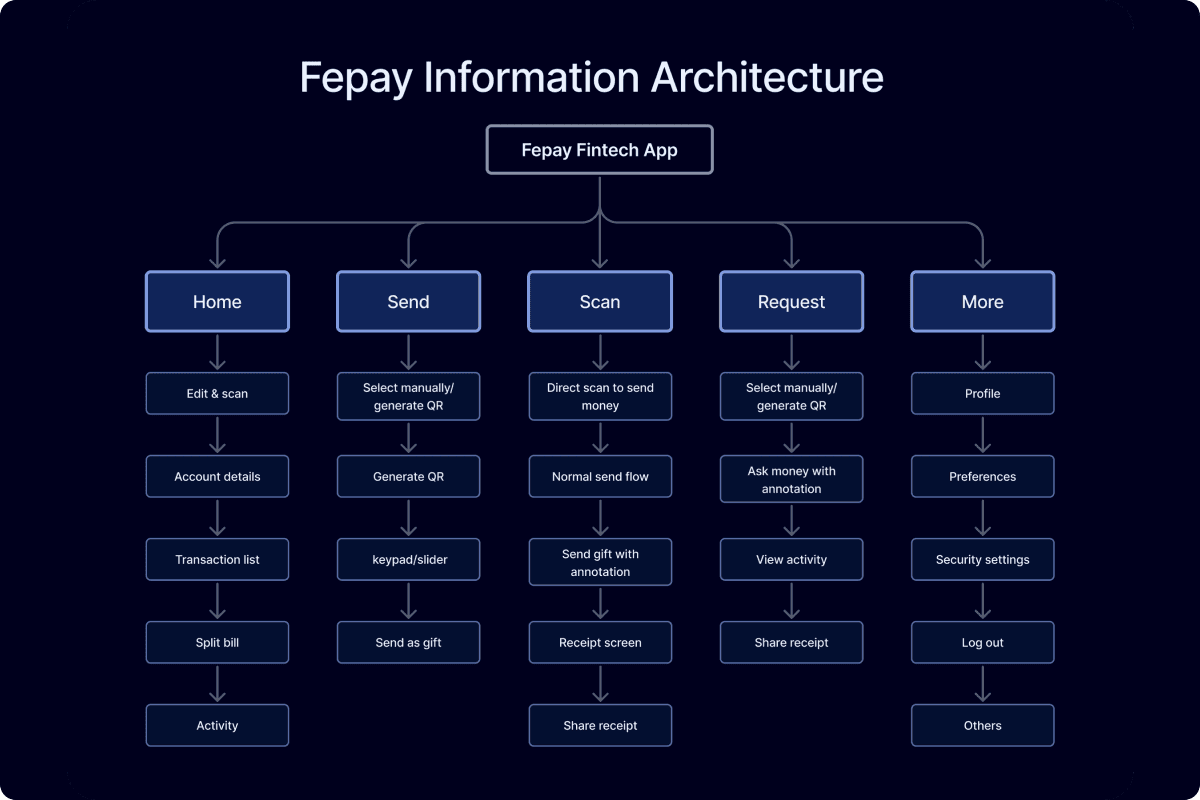
Information architecture: one gateway with Home, Send, Scan, Request, and More routed through a single transaction engine.
The approachDecisions first. Execution scoped from those decisions.


Phase 01

Architecture


Six weeks. Weekly reviews. We did not draw a high-fidelity screen.

  1. 01

    Information architecture for one gateway.

    Four payment types (send, receive, split, recurring) collapsed into one transaction engine, with a single home as the entry point. Mapped before any visual decision so the gateway shape held under every flow.

  2. 02

    User flows for every payment type.

    Onboarding, send, request, split, subscription setup, subscription management, transaction history. Every transition documented end to end. Edge cases (failed bank link, declined push, retry) included in the maps, not deferred.

  3. 03

    Low-fidelity wireframes for every state.

    Empty, mid-flow, full, edge, error. Reviewed weekly. The flow map was locked before colour, type, or component decisions entered the conversation.

  4. 04

    One change between phases.

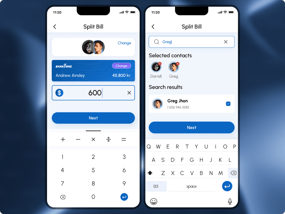
    Usability testing surfaced that users expected name search on split bill, not phone-number entry. Contact search was added to the split flow. Everything else held.


Phase 02

Execution


Eight weeks. UI kit, high-fidelity screens, clickable prototype, built in parallel tracks against each gateway flow.

Selected workVisual proof across the gateway.

Onboarding designed around MitID, not forms.

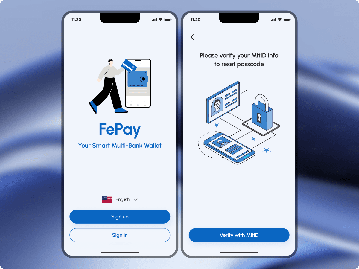
Three steps. Phone number with auto country code. Face ID setup. Bank connection via MitID, inside the app, not bounced out to the system browser. Each step confirms the last. Ninety seconds from install to first balance.
Onboarding in three steps, Face ID setup, MitID identity verification, bank connected by the fourth screen.

Every payment type as one gateway.

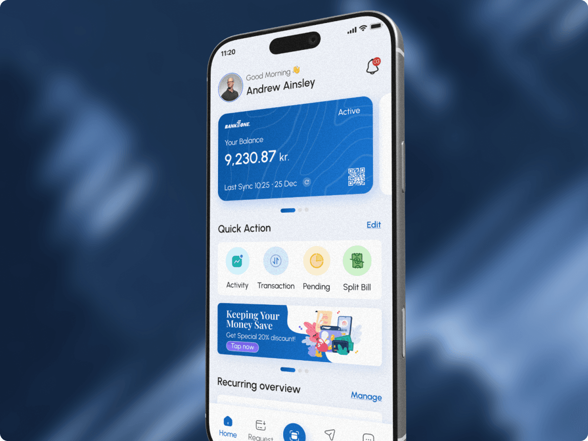
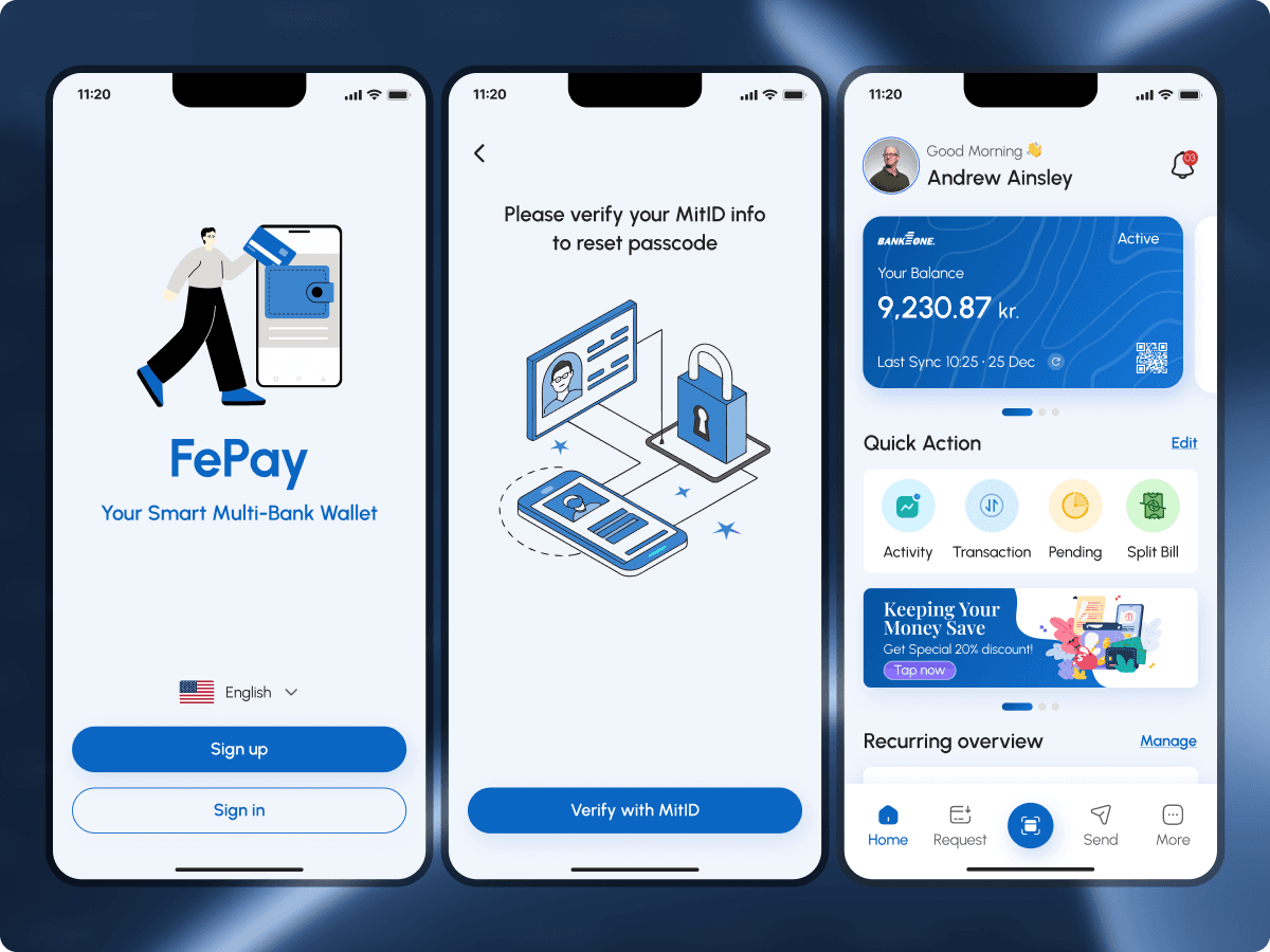
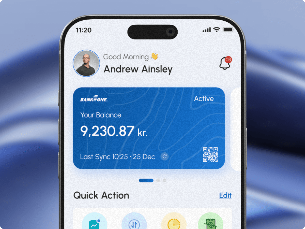
Home shows balance, quick actions, recent activity. Send opens contact search. Split Bill opens the same search with multi-select. Recurring opens a subscription dashboard. One transaction engine routes each type behind the scenes. The user sees one interface.
The home gateway, balance and Quick Actions on one side, the Send flow on the other. One home, every payment type.

Split bills without group-chat noise.

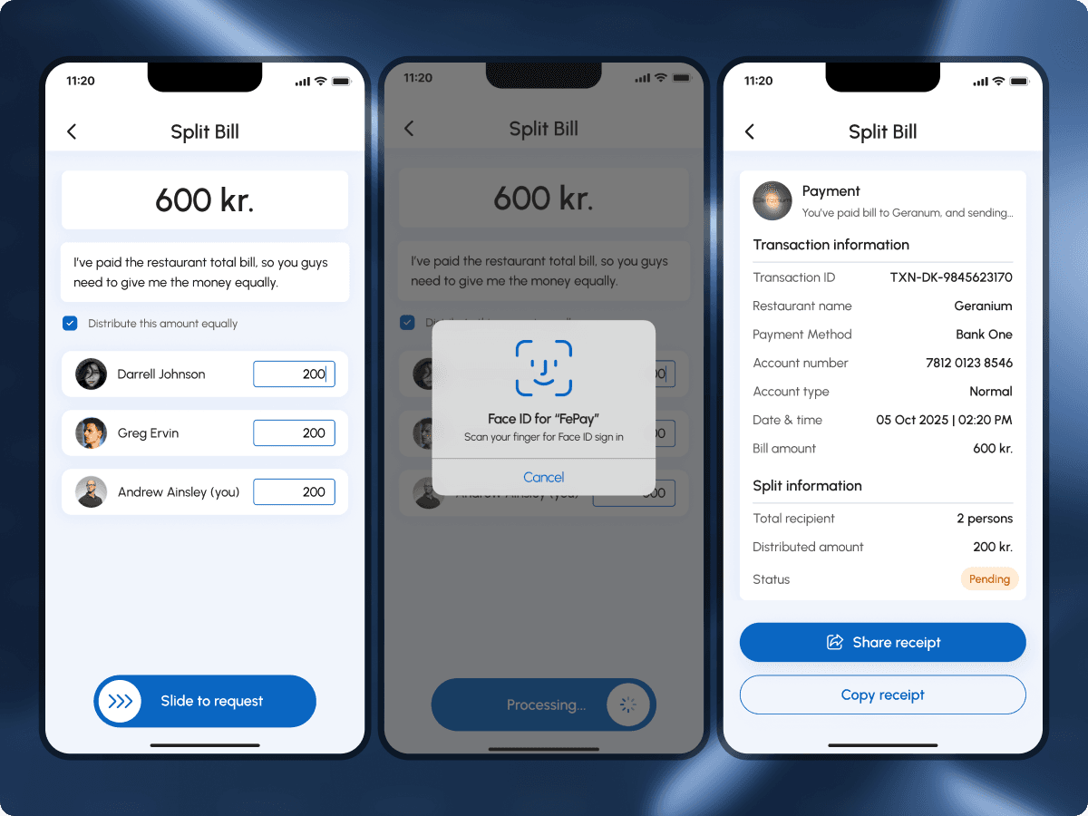
Payer assigns individual amounts (because dinners are never equal). Each recipient gets a single push with their amount and a tap-to-pay request card. No shared thread. No running total. The ask feels automatic, not awkward.
Split bill, multi-select contacts, individual amounts, Face ID confirmation. The silent split.

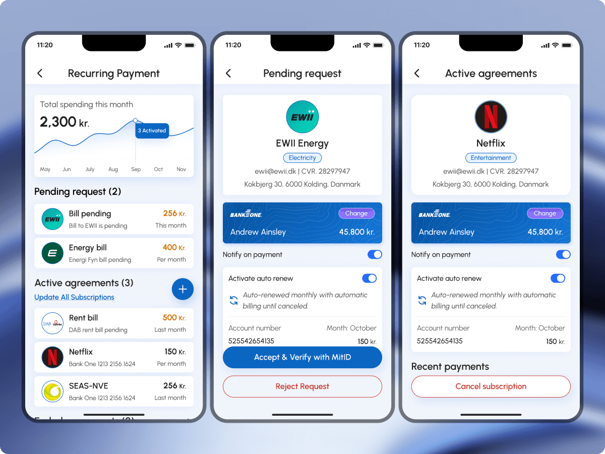
Recurring payments as a dashboard, not a list.

Three states surfaced as sections: Pending (awaiting first payment), Active (running with next charge dates), Ended (canceled). Each card shows merchant, amount, frequency, and bank account. Cards over calendar, less noise for monthly bills, more control over what drains the account.
Recurring as a dashboard, pending, active, and ended cards on one side; the full Activity and Transactions surface on the other.
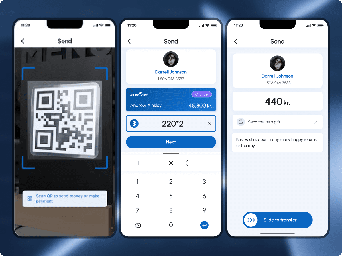
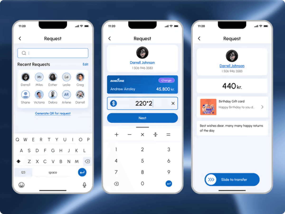
Contact-first flows, Send via search or QR scan on one side, Request with recent contacts and a gift-card option on the other.
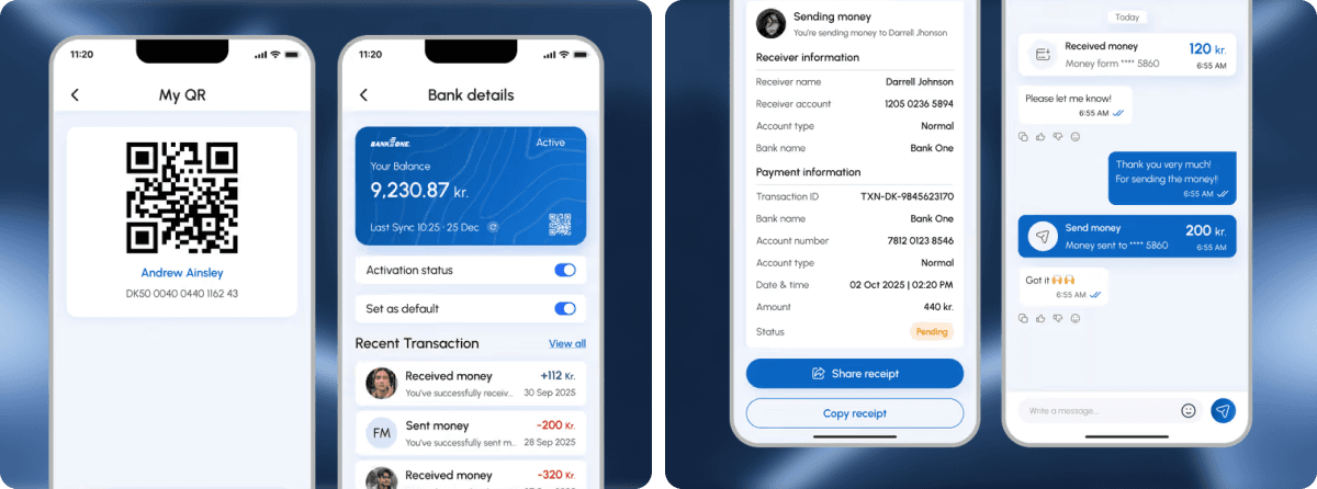
After the transaction, the shareable receipt and chat thread on one side, the user's personal QR and bank-account view on the other.
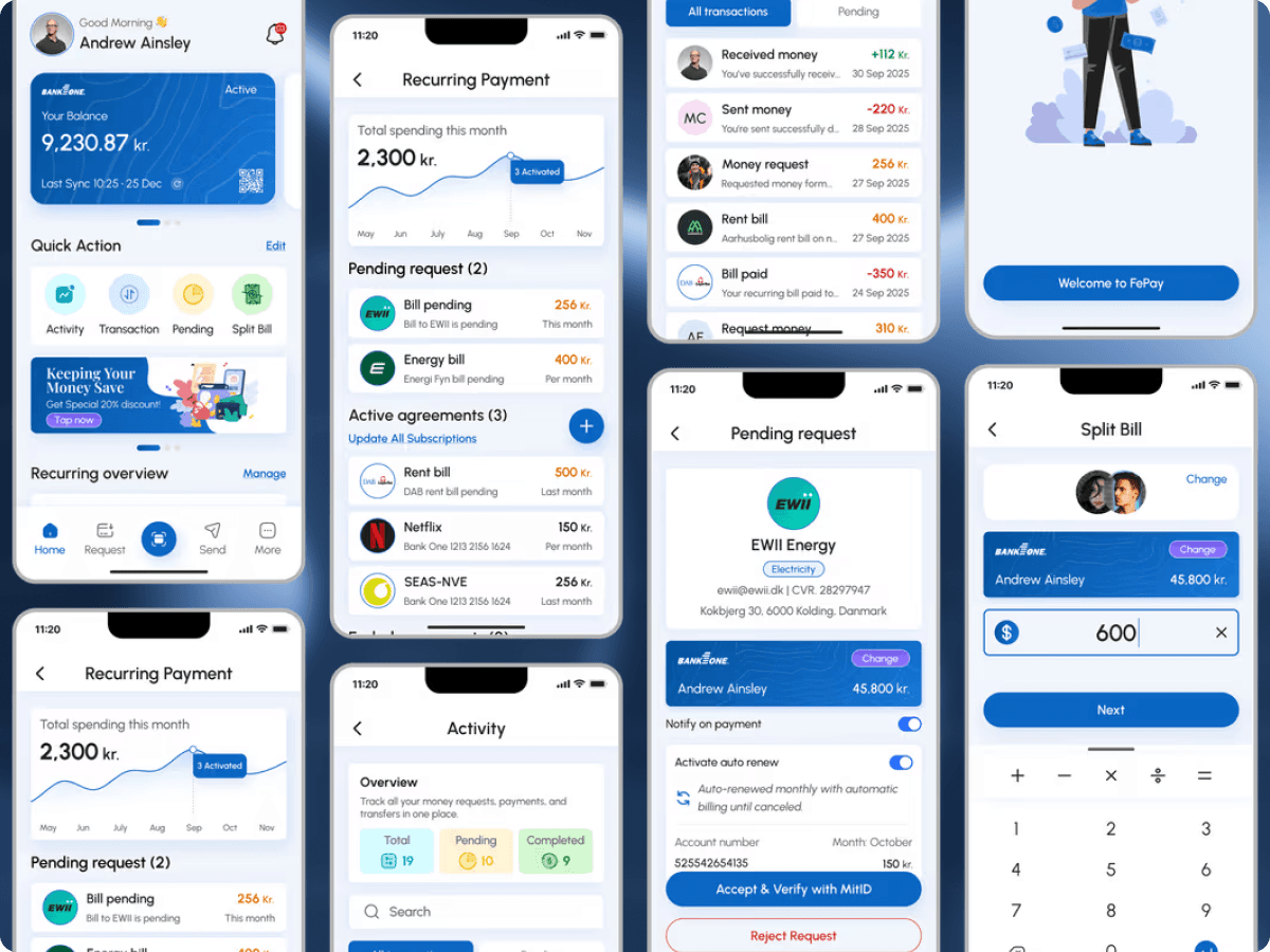
One design system across onboarding, gateway, split, and recurring, the full screen family in one view.

Key decisionsThe trade-offs that shaped the work.

We considered

Launching MitID in the system browser, the integration most apps default to, and verifying users by both phone and email at signup.

We chose

Internal MitID integration that stays inside the app, with phone-only entry (auto country code, no email step).

Because

Trust. Danish users abandon flows that bounce them out to a browser, and Danes don't verify email for payments, they verify identity through MitID. Keeping the flow in-app and dropping email reduced onboarding to ninety seconds and held drop-off under eight percent.

We considered

A tabbed navigation by payment type, Send, Split, Recurring, History, the structure most fintech apps converge on.

We chose

A single home exposing balance, quick actions, and recent activity, with Send / Split / Recurring as gateway actions sharing one transaction engine.

Because

Every additional tab is a guess about what the user came to do. A single gateway lets the user pick the action without first picking a section, and lets the backend route each payment type without the user knowing or caring. Sends settle in under three seconds.

We considered

A shared thread where everyone sees the bill, the split, and the running total, the WhatsApp-style pattern most split-bill apps inherited.

We chose

A silent split. Payer assigns individual amounts; each recipient gets a single push with their amount and a tap-to-pay request card.

Because

People avoid asking for money. A group thread makes the ask feel like an argument; a clean card makes it feel automatic. Paired with individual amounts (because dinners are never equal), beta saw a ninety-four percent payment rate.

OutcomeWhat shipped.

90s

Onboarding, install to first balance

8%

Drop-off through MitID onboarding

94%

Split-bill payment rate in beta

It is live. It processes payments. It replaced the fragmented stack FePay started with.

Onboarding takes ninety seconds. Drop-off through MitID held under eight percent. Split-bill payment rate hit ninety-four percent in beta. The gateway handles send, receive, split, and recurring in one interface. Bank connections sync through MitID, inside the app. Users manage subscriptions, pay friends, and split bills without leaving.

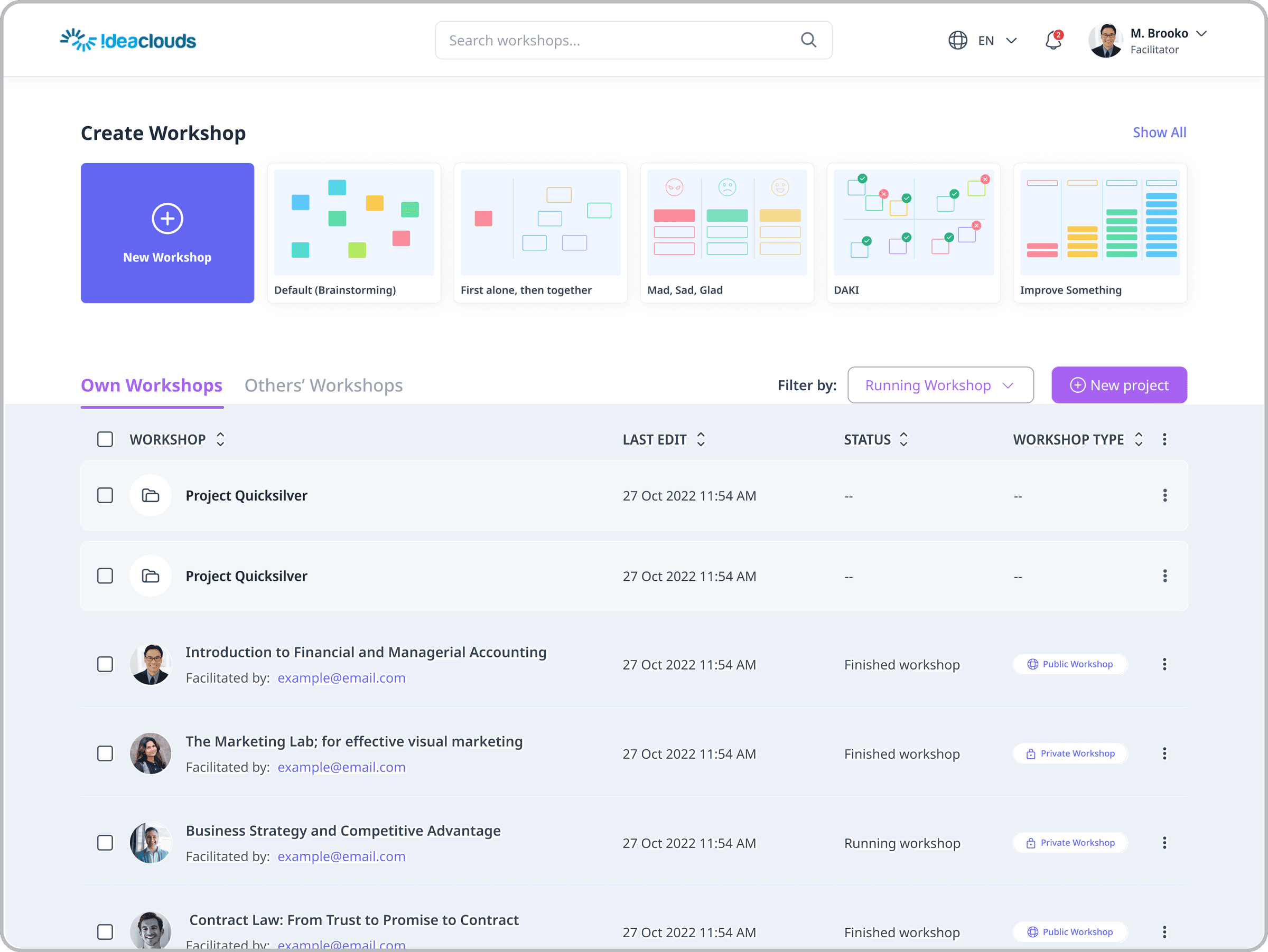
Ideaclouds enterprise workshop SaaS, create-workshop dashboard with method templates and Own Workshops list

Next case study — Ideaclouds

Enterprise workshop platform that turns weeks of meetings into one decisive session.

Or, book a discovery call.